Monday, April 20, 2009
Tuesday, December 2, 2008
Monday, October 27, 2008
Friday, October 10, 2008
Digital Art Canvas
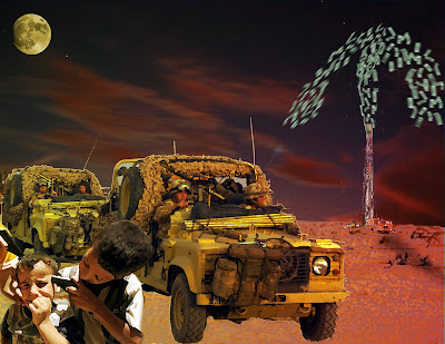
1. The theme of my digital art canvas is the middle east conflict (especially the War in Iraq). My art piece is critical of the United States imperialistic endeavors in Iraq. My piece depicts a war not against terror but for monetary and commodity gain, which is seen in the background as the oil well (commodity) is shooting out money (monetary). Meanwhile, in the front of the painting we see how this war has had an effect on the people in these regions. (Picture is actually from the war.)
2.
Principles and Elements of Design:
Balance: The left side having larger images and being lighter and the right side being darker and more barren shows a sense of balance on the picture plane.
Gradiation: The yellow to red (from light to darker) causes static gradiation on the picture plane
Dominance: Since there are larger, lighter images in the bottom left of the piece, there is a sense of dominance on the picture plane. (this avoids monotony)
Direction: The army trucks moving diagonally from left to right gives a sense of direction on the picture plane.
Texture: The brush filter used on the desert sand gives a sense of rough texture on the picture plane
Size: The background's small oil well gives a sense of size against the large night sky.
Colour: A yellow to red layer with a low opacity was put on to give the piece a primary/compound hue.
Shape: The moon in the top left corner is an example of an organic shape, while the oil well is an example of a geometric shape.
Line: The oil wells shadow creates a line on the picture plane
Friday, May 23, 2008
Tuesday, April 29, 2008
Friday, April 11, 2008
Friday, February 15, 2008
My Hero: Jesse Owens
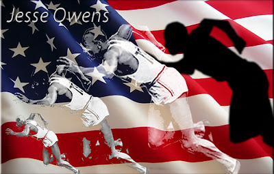
1.I have used the following motifs to generate page layout and design: An American flag blowing in the the wind as the background for the design and page layout. I have taken an image of Jesse Owens running and altered the sizes and opacity to create a stencil template on my picture plane. I choose to place the American flag blowing freely in the background to represent the liberty and hope that Jesse Owen stood for during his generation. I choose to place the images of Jesse Owens from smallest to largest body image culminating in the largest shadow image at the end. This represents the journey any man takes to achieve greatness no matter their race or color. In the end Jesse is just a man of talent and greatness (hence the largest shadow) and not a man of color or race. He could be any man.
2. The approach I took with this layout was minimal and simplistic one (I only used two images and just his name with no direct message). The reason I took this aproach especially by not using more text was to allow the viewer to evoke their own emotion and opinions when viewing this image. I hope to convey the feeling of freedom (with the american flag) and strength and power (with the image of the body in motion).
3. Colour: By using the American flag colors of red, white and blue as a background the viewer immediately sees a recognizable image that sets the tone of democracy for this poster. Since the background was already colorful the image of Jesse Owen in black and white made the most sense.
Focal Point: The largest image of Jesse Owens running (before the shadow) creates a focal point on the picture plane and also is the most developed body image as the two images before are not completely defined.
Overlap image: To get all the body images in the poster I had to overlap three of them on the picture plane and have them overlapping at the arms.
Movement: The image of the runner from smallest to largest creates movement on the picture plane.
Rhythm: This whole poster is made up of many small motifs which create rhythm or repetition. The stars and stripes in the flag as well as the image of the runner are repeated motifs adding to the rhythm.
Balance: The arrangement of the runners create an asymmetrical balance on the picture plane. The image is identical only individually magnified.
Scale: The runners increasingly growing size creates scale on the picture.
Texture: The billowing of the flag creates a smooth background texture while the graininess of the runner creates a rough texture on the picture plane.
4. The three reasons why I feel this poster is the strongest is as follows:
This poster is simple in its imaging (only the flag and the runner) but complex in its message.
I used many photo shop tools to alter Jesse Owens image which allowed me to convey my ideas.
I feel this poster with the colorful american flag is the most visually appealing.
My Hero: Jesse Owens
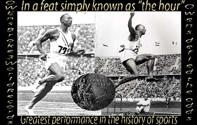
1. and 2. With this poster I took a simple approach by using a basic format with a frame around two images almost like a photo in a photo frame. I was trying to capture a "moment in time" (Jesse's greatest athletic achievement) which was why I chose to use two equally sized images just like a picture in a photo. My layout is very symmetrical with two equal sized images encompassing the majority of the poster and a round focal point in the middle of the two identical sized photos. The writing used in this poster is also symmetrical with the two vertical wordings using one shaded font and the two horizontal wordings using a bolder larger text. To add additional visual interest I have included in the center of the poster a large olympic medallion from Jesse Owens 1936 Berlin Olympic wins. The reason I chose to place the medallion in the center of the poster is to maintain the symmetry of this poster as there is only one medallion and to create some interest in an otherwise basic poster. The text in this particular poster plays an important role. It creates a picture frame in what would otherwise be an empty frame and lists actual facts about Jesse Owens greatest athletic achievements. I chose to use only two photos instead of a collage of his athletic shots because I wanted the viewer to be able to capture his one greatest hour, a specific moment of his career.
3. Focal Point: I have put an olympic medal from the 1936 Olympics in my poster. It creates a focal point because it is the centerpoint of the poster, creates a distinct line of symmetry in the poster and contrasts the colourful frame of the poster with its black and white center.
Texture: I have used various settings in my horizontal and vertical words to create texture. The horizontal, gold words seem rough and old, while the vertical silver words have a smooth, shiny feel.
Overlap: Although I have only overlaped in one instance of my poster, (Jesse's Gold Medal) I feel that it is important because it creates a focal point and a distinct line axis of symmetry.
My Hero: Jesse Owens
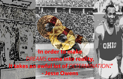
1. The layout is divided up into 3 images with the most important image placed in the center and larger than the 2 equal images on either side of the main image. Very little attention is paid to borders as the focal point of this poster is about the actual quote by Jesse Owens. The background images are in black and white because I didn't want to distract from the text which is the main motive or idea of my poster. I took the olympic medals and overlayed them on the image of Jesse to back up the quote showing that if one is determined one can achieve their goals.
2. Once again I only used 3 photos to create a simplistic poster that would assist the viewer in understanding the message. My new approach to this poster was to use various blurs and filters on the two images on the left and right so that the viewers eyes would focus on the quote and the medals in the center. This quote and medals were meant to be the focal point of the poster. I have used more text in this poster because I wanted the viewer to read the full quote and understand Jesse's philosophy. I tried to make this poster about the words and the images were meant to be the background.
3.Balance: The two equal sized photos on the left and right of my poster create symmetrical balance on the picture plane.
Overlap: I have overlapped a gold, silver and bronze medal on top of the center photo. Once again, this overlapping creates a focal point on the picture plane.
Texture: I have used various blurs and filters on my left and right photos to create grainy, rough texture on the picture plane.
5. This is my weakest poster. I was trying to create a statement using the quote that showed almost how he succeeded against all odds. I was trying to also make a statement about the context of his story, how Hitler wanted to prove the Ayrian race was the strongest and that no man of color could win the gold medal. This is why I placed an image of a Nazi athlete standing on the podium saluting in what has become known as a sign of hate and indifference. By putting filters and blurs on this image it is hard to recognize the image of the Nazi athlete. I could have made this poster more objective by not altering and filtering this photo. I could have used a different quote to explain the context of the story of Jesse Owens. I also could have made the medals more distinct to further illustrate the message I wanted to send.
Thursday, January 10, 2008
Monday, November 19, 2007
Thursday, November 15, 2007
photos of the week #15
Wednesday, November 7, 2007
Tuesday, October 30, 2007
Photos of the week #13
Friday, October 26, 2007
Faces Part 2
Monday, October 22, 2007
Friday, October 12, 2007
Photos of the week #10
photos of the week
photos of the week
Photos of the week
photos of the week
Friday, October 5, 2007
photoshop summative
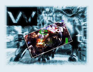
a.I have used iconic images examples of both are iconic: The bull on Wall Street is iconic to wealth and a strong market because it is on Wall Street, where the world's biggest stock exchange is.The masonic pyramid is also iconic with power and wealth
b. I think the most powerful part of my image is the bull's head which represents power beacuse it is blended with the New York Stock exchange which represents wealth and Uncle Sam, an iconic image of american freedom to cinvey a message of power, freedom and wealth.
Monday, October 1, 2007
Thursday, September 27, 2007
Photo 3
Photoshop 2
Tuesday, September 25, 2007
photoshop 1
School Life #2
Friday, September 21, 2007
Subscribe to:
Posts (Atom)


 This is Alex To and I having fun play fighting in the grade 10 halls.